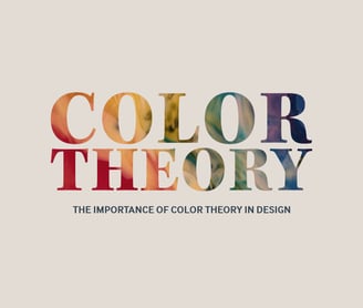
Color Theory & Design
In this blog we discuss the importance of color theory and design.
GRAPHIC DESIGN TIPS
Kiersten Poland
8/22/20242 min read
Color Theory & Design
Why Color Matters in Graphic Design
When it comes to graphic design, color isn't just a decorative element. It's a powerful tool that influences the way people perceive information and feel about a design. Understanding the basics of color theory can make or break a design. Whether you're a seasoned designer or just starting, a good grasp of color theory is essential for creating visually appealing and effective designs.
The Basics of Color Theory
Color theory is the science and art of using color. It explains how humans perceive color, how colors mix, match, or clash, the subliminal (and sometimes cultural) messages colors communicate, and the methods used to replicate color. The color wheel—a circle with various colored sections used to show the relationship between colors—is a foundational tool in this theory. Primary colors (red, blue, and yellow), secondary colors (created by mixing primary colors), and tertiary colors (created by mixing primary and secondary colors) are all represented on the color wheel.
The Psychological Impact of Colors
Each color can evoke different emotions and reactions. For instance, red can evoke feelings of passion or urgency, while blue can instill a sense of calm and trust. Knowing how to use these psychological cues can help you design with purpose:
1. Red: Often used to grab attention, red is great for call-to-actions and alerts.
2. Blue: Promotes a feeling of reliability and security, making it popular in the tech and finance industries.
3. Green: Evokes a sense of balance and harmony, commonly used in environmental and health-related designs.
4. Yellow: Invokes cheeriness and positivity but can also be overwhelming if overused.
Applying Color Theory in Graphic Design
Now that you understand the basics of color theory and the psychological impact of various colors, how do you apply this knowledge to graphic design?
First, consider your audience. Who are you designing for? What colors might resonate with them? For instance, a children's website might use bright, primary colors to attract attention and stimulate young minds. On the other hand, a law firm might use more subdued colors like navy blue and gray to evoke trust and professionalism.
Next, think about the message you want to convey. Are you creating an urgent call-to-action? Use bold colors like red or orange. If your goal is to create a peaceful, calming environment, opt for blues and greens. Always be mindful of color contrasts to ensure readability and accessibility.
Conclusion
In the world of graphic design, color is far more than just an aesthetic choice. It's a vital element that can affect how people perceive and interact with your design. By mastering color theory, you can create designs that are not only visually appealing but also effective in communicating your message. So next time you're faced with a design challenge, remember to think about how color can help you achieve your goals.

Get in touch
hello@humblecreativedesign.com